Mapping Disasters and Development
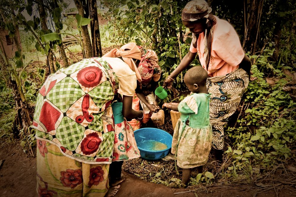
Whether it’s from seasoned practitioners or those new to international development or humanitarian relief, we hear it all the time. An NGO working on a project later learns that another organization is doing similar work nearby, or even in the same location. The government of a country receiving aid has trouble planning its budget because it doesn’t know how much funding is being provided when, or which NGOs are working in their country. One community receives an over-abundance of assistance while another with greater needs is ignored.
For the past six years, InterAction has been working on the development of an interactive, user-friendly visualization tool called NGO AidMap that is based on the premise that access to timely, high quality, and comprehensive information is critical to making aid work better.
In part, the tool is meant to help InterAction tell the story of our members, a collective community of more than 180 NGOs working to advance human dignity and fight poverty around the world. But what we’re really trying to do is help address some of the common challenges faced by organizations working to eliminate poverty or respond to humanitarian crises: duplication of efforts, lack of coordination, and inappropriately (or sub-optimally) targeted aid. By making it easy to find information on who is doing what and where, NGO AidMap aims to help organizations make smarter decisions about where to direct their resources, identify gaps and avoid duplication, and find opportunities to collaborate and cooperate with potential partners.
So far, we’ve collected information on more than 9,000 projects from over 130 organizations in more than 150 countries, amounting to over $10.6 billion in programs. Along the way, we’ve learned a lot about how to make data matter.
CHARTING A NEW COURSE IN THE WAKE OF DISASTER
NGO Aid Map began in Haiti. Though we had been working with our members for some time on ways to help capture and visualize their work, it was not until the devastating 2010 earthquake that the mapping initiative really took off.
The scale of the earthquake, intensity of media coverage, and depth of the public response created a sense of urgency and made organizations realize the importance of sharing information on their activities. It was clear that NGOs had to demonstrate to their donors and the general public that they were willing to be held accountable. By June 2010, we had created a map that allowed our members to see not only where work in Haiti was taking place, but the nature of the work being done.
Knowing that it would take time before our members were ready to contribute data on all of their work – and before we would have the capacity to handle all that data – we decided to expand the site slowly, one map at a time. This year, at our annual conference in June 2014, we finally reached a major milestone in the initiative, launching a global map covering our members’ work in all countries and all sectors.
MAKING A MAP THAT WORKS
Gathering up-to-date, standardized data from over 100 NGOs is no small feat. Getting here has required us to continuously focus on two things: understanding our members’ motivations for sharing data, and ensuring the quality of the data on the site so it is trusted and used.
Building political buy-in was the very first step. From the beginning, we’ve made it a point to work closely with our members, who we’ve consulted on everything from data standards to the functionality of the tool. We knew from previous experience that just demanding information wouldn’t work; members had to feel comfortable if we were going to get data with the level of detail we were asking for. We had to build their trust and help them understand the risks and benefits for sharing information. They needed to know that the time and effort spent providing this data was worthwhile. We’ve learned that most NGOs are willing to share data for three main reasons:
1) To raise the visibility of their work, both as individual organizations and as part of the larger NGO community
2) To demonstrate their commitment to transparency
3) To save time, by giving organizations a resource to which they can direct their key constituents and donors.
In addition to understanding motivations, we also spend a lot of time thinking about what we can do to improve the site’s data quality. An online visualization tool is only as good as the data, and good intentions must be married with good data collection protocols.
TO MAKE A DIFFERENCE, MEASURE IMPACT
In the end, NGO AidMap’s measure of success is not how much data is gathered, but whether that data is used to improve how development is done. Like so many worthwhile things, that is a very hard thing to measure. We do know few things, though. From Google Analytics, we know that people from countries all over the world are visiting the site, and in November alone, we received more than 10,000 visits.
From surveys, we also know a little bit about who those people are: most are from NGOs, followed by universities or think tanks, the private sector, and donor agencies. User feedback suggests that NGO AidMap is a powerful tool and “discussion starter,” helping NGOs and their funders demystify the complex web of international aid.
In the case of Haiti, for example, one of our members reported that NGO AidMap helped them “find out more about the ‘spread’ and allocation of aid throughout Haiti,” and better understand the “obstacles and issues faced by other organizations.”
Others have reported using NGO AidMap to inform proposals, to share information about their work with governments and funders, or to find out who might be responding to a disaster or supporting certain groups (such as people living with disabilities). These anecdotes have proved invaluable as we look for ways to improve NGO AidMap as a tool for organizations to do more and do better work in the field.
BUILDING FOR THE FUTURE
We still have a long way to go before we have information on all of our members’ projects. And we realize that, even if we did have this, information alone is not enough to make development better, but it is a necessary step for long-term success.
The NGO community is stronger when it works together. By working with NGOs to help them collectively harness the benefits of new mapping and other data visualization technologies, we can help build the tools today that will help address the humanitarian emergencies and aid efforts of tomorrow.
Editor’s note: This blog first appeared in NTEN: Change, December 2014, CC BY-SA 3.0 (http://creativecommons.org/licenses/by-sa/3.0/)
Julie Montgomery
Laia Griñó
More like this